Kia Holidays
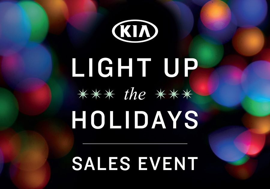
In 2017, Kia’s holiday campaign was this Light Up the Holidays Sales Event. Since this is an event that comes from Kia corporate, all marketing on the dealership level must comply with Kia’s brand standards and guidelines. For this case study, I wanted to show how I redesigned a dealership email to comply with the brand standards and guidelines for the Light Up the Holidays campaign.

This is the redesigned email that I created. One requirement of the holiday campaign was to feature the logo at the top of all emails. Also, the Kia logo must be on a white background with a certain amount of white space around it. I made these changes to comply with the brand standards. I also used the Kia font as the primary font for all the text and offers. This was not a requirement, but it made sense as a way of maintaining the overall Kia look and style.

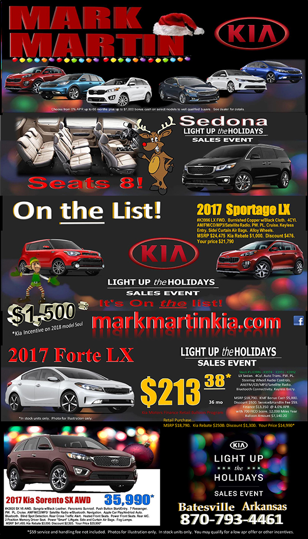
Here is the email that the dealership created. Aside from the overall design issues, the Kia logo is not on a white background and the Light Up the Holidays logo is at the bottom of the email almost as an afterthought. Both logos appear multiple times on this email and are used incorrectly in all instances. Also, the logos are stretched and resized without maintaining the original ratio.
