School's Out
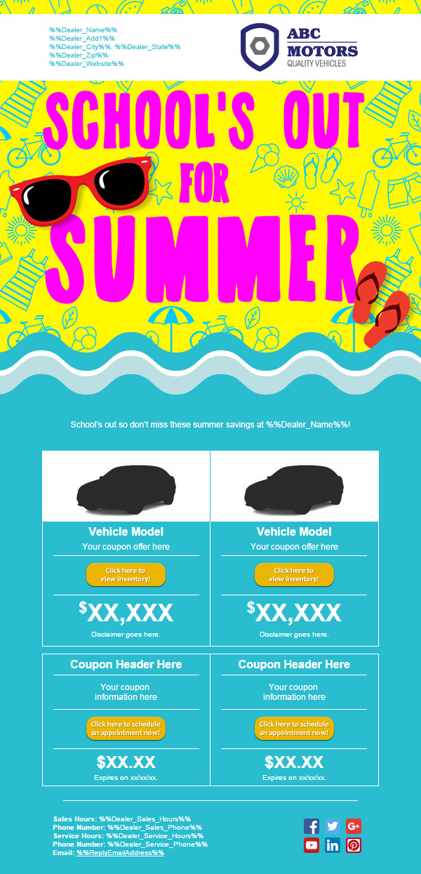
School’s Out for Summer is a one-off email-only campaign. This type of campaign allowed dealerships to quickly send out marketing based on lesser events of the year.

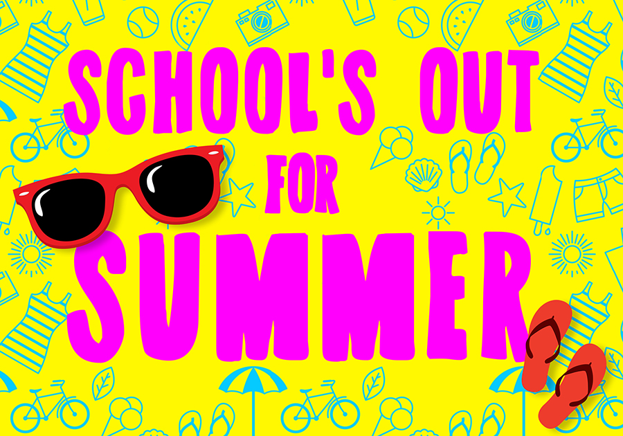
For this campaign, I got to play with different vibrant and fun colors. When school ends for the summer, it’s usually kids who are the most excited, so I went with a kid-friendly design using a lot of bright colors and messy typography. To separate the header from the body content, I used a wave since the beach and ocean are representative of summer vacation. The blue color of the wave is also much easier to look at as a background color than the yellow in the header image.
